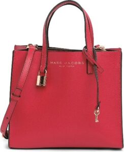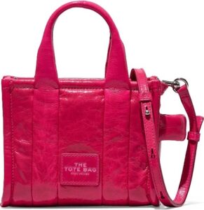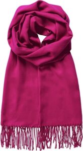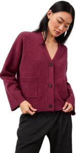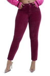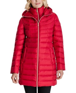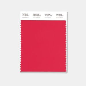
Every January Pantone announces a “Color of the Year.” This year it’s called Viva Magenta. That means you will expect to see it in advertising, home furnishings, and fashion. The color swatch you see on the left here was pulled directly from the Pantone site.
Now, if you do a further search on the very same Pantone website and click on the “2023 Color of the Year” the first image you see is this one. (Below)
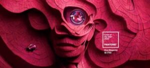
They both have the exact same numerical identity: Pantone 18-1750. So you tell me. Are these two colors the same? The first one above is warmer and brighter. This one is cooler and darker.
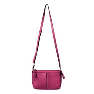
(Note: the textile of a product changes the overall quality of what it expresses. The version of Viva magenta here is duskier and warmer. It conveys a different, more subtle quality. The handbag, because it is reflective, projects a slightly more forward, energetic quality. We’ll learn more about textiles in my future posts.)
Real Magenta
When I showed my hub those two colors, he said neither reads as magenta. The reason he knows this is because he used to be an engineer at a TV station. One of the things they do is calibrate the on-air colors to specific colors, and one of the colors they use is magenta. It is opposite from green in light spectrum. (See my footnote at the end of this post for an interesting dive into light color vs pigment color.)
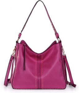
 A true magenta is bluer, leaning toward purple (as in these two examples.) It is a calmer color. It is a more royal color. But in the first image above it seems that Viva Magenta emphasizes the “viva” part. It’s redder, warmer, edgier, and has a very different energetic quality. It is a more vibrant and enthusiastic version of a red than is a true magenta. And the second version they show is a much cooler, less animated color.
What does this color portend?
Pantone offers some pretty hyperbolic language to describe the color on their page (the second image) this way:
“Pantone’s Color of the Year, Viva Magenta vibrates with vim and vigor… expressive of a new signal of strength. Viva Magenta is brave and fearless, and a pulsating color whose exuberance promotes a joyous and optimistic celebration, writing a new narrative.
“…(it) is powerful and empowering… an electrifying, and a boundaryless shade that is manifesting as a stand-out statement…Viva Magenta welcomes anyone and everyone with the same verve for life and rebellious spirit. It is a color that is audacious, full of wit and inclusive of all.”
 Now, does this color really say, “rebellious spirit” to you? “Pulsating?” Is it a “joyous and optimistic celebration?” It’s not that I don’t like this second version. It’s beautiful and sophisticated. I actually love sophisticated colors exactly because they are not “electrifying” or “stand-out.” They make the person wearing it appear very elegant.
Regardless, it’s an interesting choice for the coming year!
Who Can Wear It?
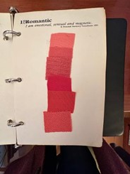
Andrea’s 3rd page of “Romantic” colors from PSC
Let’s start with the first version in the color swatch. In spite of it being “inclusive of all” I looked at my own color palette (70% Earthy Rich – or autumn), 20% Lively Bright (spring), and 10% Subtle Blended (summer.) The color in the swatch at the top of the article is a bit close to one of the colors on my third page of “Romantic” reds.
That gives me a clue that maybe the only color harmony that it would not work well for is someone who is primarily Striking Contrast (winter) coloring. It doesn’t have the oomph and clarity that is typical for a winter type’s reds.
The second color they show – which is a little confusing since they show part of it in shadow and part of it highlighted – looks like a color that might suit someone who was a combination of a Subtle Blended and Striking Contrast coloring.
But seen in the un-shadowed areas, it definitely has some warmth. So maybe it could work for several seasonal harmonies. What is fascinating to me about Personal Style Counseling’s color analysis is that the exact same color can have a very different effect on two different people. A color that appears in the “Romantic” red portion of someone’s palette, may appear in the “Sophisticated” page of another person’s palette!
How to “Fudge” Viva Magenta for Yourself
Designers often take some pretty wide liberties with the Pantone Color of the Year. You’ll be seeing fashions in multiple shades of the red family identified as Pantone’s Viva Magenta. They include everything from a whole lot of really bright pinks to burgundies, and some very-close-to-actual magentas. There were even more orange versions of the first, brighter color, all the way to mauve, including a very dark, muskier mauves, and to yes, actual magenta. Go figure. So, there’s something for everyone. You probably can find a shade or close to a shade of either color that works for you.
A Lesson About Color
 Regarding my husband’s comment about magenta, here is what I learned.
Colors derived from light sources (your computer, mobile phone, tv screen, LEDs, etc.) are called “additive” colors. That means that if you combine two different colors of light, you get a third. The combination of all the colors of light creates white. The basic colors in the additive light spectrum are Cyan, Magenta, Yellow, and Black.
In the light spectrum magenta is the opposite from green. Magenta absorbs green light. Green light absorbs magenta. If you combine green and magenta lights, they absorb each other, and you get… white!

Courtesy of Red Yellow Blue.org
Printed pigments on paper or textile are called Subtractive colors. You get a specific color by taking away everything except the color you want. If you take away everything except magenta (a combination of red and blue) in one ink and take away everything except green (a combination of blue and yellow) in another ink and then combine those two colors you’ve subtracted nearly all colors. You get a muddy brown or nearly black.
That’s why when you look at a printed page very closely, you will see tiny dots of color placed right next to each other, not on top of each other. That creates the illusion of a flat single color.
Learning About Color
 This is why color analysis is both an art and a science. We’ll be diving into the color spectrum more in the several coming months in a lead up to the color course I am creating. My mentor, John Kitchener, graciously contributed a great deal of material to incorporate into it and I’m excited to share all of that with you.
 If you are as fascinated with this whole process as I am (and as nit-picky) I highly recommend getting a color analysis. For those on the East Coast John is currently outside of Atlanta, GA. He books months in advance. But we are blessed to have his most experienced student, Hella Tsaconas, here on the West Coast. Hella does color consulting using the exact system that John does and is authorized to represent his system accurately. Give her a ring if you are interested.
Onward to a brighter, more colorful 2023!
Note: If you haven’t yet watched my course, Discovering Your Inner Style, I am making it available for one week only at the discounted price of $39! This is coupon code you use: JAN39 And, here is the full description.
![]()
[Links on this page may earn me a (very) small commission if you purchase anything. It’s what helps me keep writing this blog and my upcoming courses. Thanks!]
